7 Quality Management Tools
Markets and economies keep changing at a very fast pace. And in order to keep evolving and improving, companies need quality management tools. This quality management tools are used not only to keep up with market changes, as well as they also allow managers to improve their businesses and to ensure a competitive position.
Many managers think that by having the latest tool they'll succeed. This is not true at all. You, as a manager, need to rely on quality management tools that can be adapted to what your company needs.
Here are 7 basic quality management tools that are a must have:
Many managers think that by having the latest tool they'll succeed. This is not true at all. You, as a manager, need to rely on quality management tools that can be adapted to what your company needs.
Here are 7 basic quality management tools that are a must have:
Cause-and-effect diagram (also known as Ishikawa, or Fishbone chart)
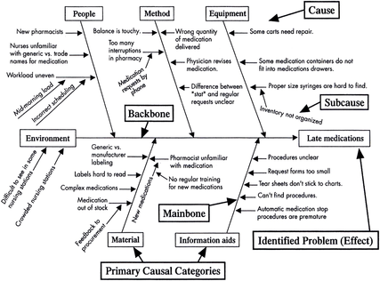
When your business is dealing with a specific problem and you're thinking about the possible causes, a cause-and-effect diagram may be the tool you need. This may show better results when you are in a brainstorm session.
It's very easy to make your own Fishbone chart. Just grab a whiteboard or flipchart and some marking pens. Write the problem you're dealing with right in the center and draw some arrows pointing to it. The next step is to try to identify the major categories of causes and write those down from the main arrow.
That that you've identified all these categories, you need to keep asking and brainstorming about "Why does this happen?", writing down the several causes as branches.
When the ideas finally end, you need to look at not to where the most ideas are, but where the fewer ideas are.
Check sheet
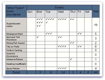
A check sheet is a structured for that is ready to be filled with the data you need, and that can be adapted to different goals.
Let's say your business, every now and then has a particular problem that you need to solve. All you need to do is to create a sheet where you write all the data you need to be collected and for how long. Make sure to test the check sheet for a short period of time to make sure you're gathering the right data and that people who are filling it don't have any problems. Now, each time that specific problem occurs, just record the data on the check sheet.
Let's say your business, every now and then has a particular problem that you need to solve. All you need to do is to create a sheet where you write all the data you need to be collected and for how long. Make sure to test the check sheet for a short period of time to make sure you're gathering the right data and that people who are filling it don't have any problems. Now, each time that specific problem occurs, just record the data on the check sheet.
Control chart or statistical process control
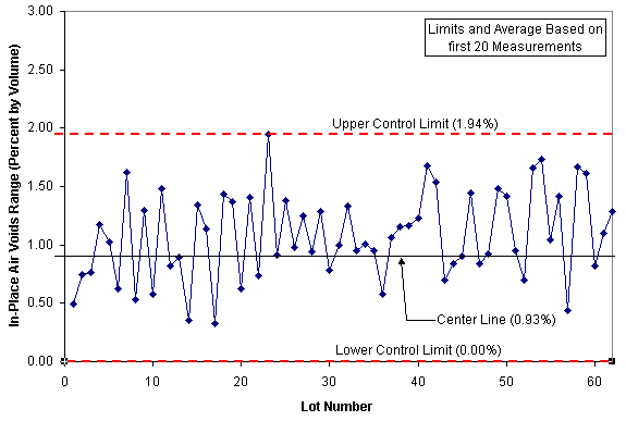
Control charts (or statistical process control) are used to see how a specific process changes over time. There are some situations where you might need to use one:
- When you are trying to find and correct the problems as they occur during the process;
- When you forecasted the range of the outcomes from a process;
- When you are trying to see if a specific process is stable or not;
- When you are trying to find and correct the problems as they occur during the process;
- When you forecasted the range of the outcomes from a process;
- When you are trying to see if a specific process is stable or not;
Histogram
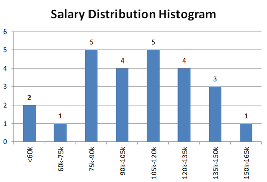
A histogram is one of the most commonly used charts for showing how often each different value in data occurs. Histograms need numerical data. So, they work best when you're analyzing a process to see if it meets the customer's requirements; when you're trying to figure out if any process change occurred from one period to another; and even when you're trying to find out whether the outputs of at least 2 processes are different.
Pareto chart, also known as Pareto diagram or Pareto analysis
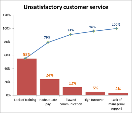
When you look at a Pareto chart, you may think it's a bar graph, because they are similar in format. Although, the Pareto chart also has a line.
To properly read a Pareto diagram, you need to know that the individual values are shown by bars, and the lines represent the cumulative total.
When you're looking at a Pareto diagram, the length of the bar usually represents the cost or frequency (money or time). And this isn't the only difference. Pareto charts are arranged by having the shortest bars on the right and the longest bars on the left, which allows you to take almost immediate conclusions.
You should use a Pareto diagram when despite you have different problems you just want to focus on one; when you're trying to discover the problems or causes frequency in a process; and also when you're analyzing broad causes simply looking at their specific components.
In order to use a Pareto chart, there are some things you need to decide first: what categories you will use your group items; what measurements you're going to use (frequency, cost, time, or quantity); and for how much time.
The ultimate goal when you're using a Pareto diagram is to distinguish the most important factor (usually a handful of factors). When you're talking about quality control, for example, it usually represents the highest occurring type of defect, the most frequent reasons for customer complaints, or the most common sources of defects.
Scatter diagram, also known as Scatter plot, X-Y graph
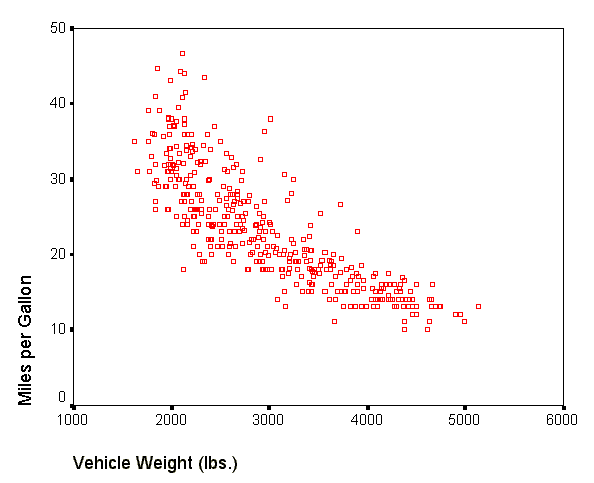
With the scatter diagram, you'll be able to discover of there is any correlation between two variables.
The use of a scatter diagram may be particularly helpful when you're trying to determine the cause of a problem, when after using a Fishbone diagram you're trying to see if the cause and effect are actually related, as well as when you're trying to figure out if two effects that seem to be related both occur with the same cause.
The use of a scatter diagram may be particularly helpful when you're trying to determine the cause of a problem, when after using a Fishbone diagram you're trying to see if the cause and effect are actually related, as well as when you're trying to figure out if two effects that seem to be related both occur with the same cause.
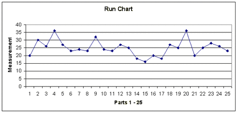
Stratification, also known as flowchart or runchart
Stratification shouldn't be used alone; it should rather be used in conjunction with other data analysis tools.
When different data is gathered from different sources and categories, and it's all put together, you may have some difficulties analyzing the data. And when you use stratification, you'll see the data separated, so that you can actually see the patterns.
When different data is gathered from different sources and categories, and it's all put together, you may have some difficulties analyzing the data. And when you use stratification, you'll see the data separated, so that you can actually see the patterns.
Watch this video to learn more about 7 tools of quality

